Then along came Lotusphere and Nathan and Chris' now famous BP101 - Interface Matters presentation, and I was once again dazzled by what could be achieved with layers. Also at Lotusphere, Ben Langhinrichs discussed using layers in his portion of Speedgeeking. That was so overwhleming (both Ben's content and the session) that I didn't have time to process it. And finally, Ben published another article about using layers that had some truly amazing effects. So I knew layers were nifty, I just had to find a place to use them in the course of my work.
In a recent application users are entering customer information for a special order. In the following section only two fields are required and I'm using a field hint to indicate that. I started out with a fairly standard layout that you see all the time:

And of course users would end up filling it out like this:

I talked to the users about this and they said the fields were running together visually. Okay, using OS style fields and laying it out better would help, but mixing formats on the same form would be messy and I didn't want to convert everything to OS style right now. Also, users didn't really understand that they didn't have to fill out the address fields. As they tabbed through the form their cursor would land in those fields so they completed them. I could have altered the tab order, but the rest of the form has over 60 fields (not all visible at the same time so calm down, Nathan). And besides, now I finally had a reason to figure out layers. :)
Here's what I came up with. Now if the user needs to fill in the address, they click the Address hyperlink
 ... fill in the information ...
 ... and click Close to see the information displayed on the main form. I decided not to use labels since it's obviously an address.
I know I need to do some more work to make this more appealing, but still this is a step forward. I have seen lots of demos of layers, but I haven't seen a step by step walkthrough of how to implement one from start to finish. Maybe that's because I'm more dense than most and everyone else has figured it out already, but in the off chance there are any other slow people out here I thought I would share a detailed tutorial.
Before I get into how this was built, there are some mechanics you need to know.
- You hide a layer by applying a hide/when formula to its anchor. If you just hide everything on the layer you can't click anything underneath the layer, but you won't have any visual indicator of why. Conversely, hiding the anchor hides everything on the layer, so you don't have to put hide/whens on every element that is on the layer.
- Positioning a layer is more art than science. Designer adds some padding to things that can throw the position of the final display off a little, so expect to do some tweaking. I have had to close out of Designer and Notes and clear my Notes cache to get some odd display issues to clear up.
- You can show or hide a layer in Designer by right-clicking the layer or its anchor and using the context menu. Once you get a layer positioned exactly where you want the last thing you want to do is drag it out of the way.
 What you see here is an outer 1 x 2 table with the yellow header. The second row of this table has a 2 x 1 table. The inner left column has a 2 x 3 table with the always visible fields, and the inner right column has a 2 x 1 table. The most important part is this inner right column. This contains the hyperlink to open the layer, the layer anchor, and the field that will hold the final results of the user's action.
I didn't have to use a table for the Address hyperlink and the layer anchor. At first I just had everything aligned vertically, but when the layer becomes visible, the anchor also becomes visible and you can see the screen jump. By putting the anchor beside the Address link, which is already visible, there is no jump. There are probably other ways around that issue, this is just how I chose to handle it. I'm also very picky about stuff like that.
Showing and hiding the layer is the most complicated part of this operation, but basically all you're doing is setting a flag that is used in a hide/when formula. Highlight the Address text and create an Action hotspot as follows:
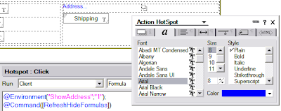 You'll notice I'm using the notes.ini to store the address layer's state. I'm doing this so I don't have to clutter the form with fields. Also, I can use this same variable for multiple applications if I start using an Address layer popup frequently. You could use a field on the form to store this if you choose. Let's set the hide/when on the anchor to make use of the environment variable:
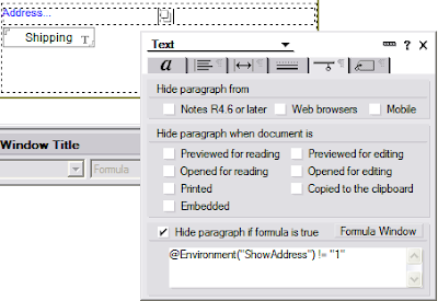
... and move on to positioning and sizing the layer.
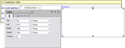 You can put fields directly on the layer, but you'll notice the formatting options for a layer are pretty limited. I chose to leave mine blank and use a table as my main container instead. I set it up with a border and a drop shadow, since it is displayed as a popup
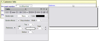
Now we can put the fields on the layer, and I used another table for the layout
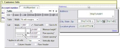 All the fields are set to OS style and I played around with the widths until I got them to line up nicely when they were displayed for the user. The final step is to code the Close link, which updates the Shipping field on the document and hides the layer
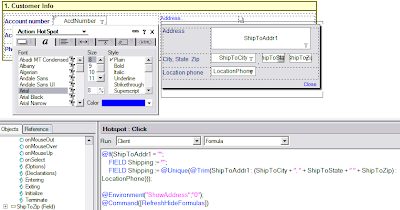
I'm using a field for the shipping information because I later use this information in a form letter. Rather than having to deal with all the discrete fields I aggregate them once to make it easier on myself later. Since I need to show it anyway, it's a win/win.
The final step is to make sure the layer is hidden if the user closes the form without clicking the Close button on the layer. I do this by setting the environment variable in the QueryClose event

And here's the final database: LayerDemo.nsf The UI is a little funky, it's got some concepts I'm playing around with. I figured while I was playing around with layers I might as well get a little crazy with some other ideas. :-)
[Many thanks to Nathan for pointing me in the direction of using the notes.ini variable. I also want to thank Nathan for making me aware of @Command([RefreshHideFormulas]). I hadn't come across that in 7 years of doing Notes development, but it sure would have made lots of things much easier if I had known about it sooner.]
oh crap! I need to fix those inline graphics!!
ReplyDeleteWill do that by tomorrow. I hope I still have the originals!!!
GREAT article, Charles. Congrats on finding a place where you wanted to use the technique!
ReplyDeleteA tip: instead of putting the layer anchor to the right of the Address... hotspot, make a very small cell to the left. Just put the anchor inside this cell. Then, when you set up the table, use the OUTER border control to push it down underneath the original Address... hotspot. That way, your layer anchor can use the AUTO setting for top and left positioning, which will improve the fluid behavior of your form.
You can also tinker with the AUTO settings in the height & width controls on the layer to get some interesting fluid behavior. But just try what I've outlined here first. :-)
Thank you, very fine described! I will give it a try today =)
ReplyDeleteCharles - Great article! As much as I like to present on the topic with odd effects and ideas, it is good to see a fairly practical use with a clear step by step instruction. I'll send people your way. (And by the way, my post was called Not your parent's form design and it has a link to the sample db I used in Germany, which is much more useful than the SpeedGeeking sample)
ReplyDeleteNathan, thanks for the suggestion on using the Auto setting with the outer border on a table. That makes sense, now I just need to tinker with it to make it work. :)
ReplyDeleteBen, thanks for the link, I'll update the original post.
Charles...excellent post sir! Nothing for me to add between your great explanation and the follow-up comments. In case you never saw it, here's a post you (or your readers) might be interested in. A while back, I wrote about using layers to create cascading menus and my techniques are very similar to yours.
ReplyDeleteIt's Got Layers...Cascading Menus In the Notes Client
Cheers!
Thanks for the link, Chris, I wasn't aware of your blog when you posted that last August so I missed it.
ReplyDeleteFirst, awesome description of how to use layers - so many new toys, so little time...
ReplyDeleteSecond, something you may want to think about relative to:
You'll notice I'm using the notes.ini to store the address layer's state. I'm doing this so I don't have to clutter the form with fields. Also, I can use this same variable for multiple applications if I start using an Address layer popup frequently.
Think about a case where you have a power user with 2 or more apps open at the same time or if you have apps that work together - if you're using one ini variable, you're going to step on your own toes if you're not careful.
Thanks again.
Doug Finner
Doug (dogu?) - Yeah, I've thought about that. I only have one app in production so far that uses this so it's not been an issue. Nathan is the one who suggested this approach, and he recommended I use application-specific prefixes to prevent the "stepping on toes" scenario you describe. It would probably be safer to use a separate variable for every application (or even every form) than try to squeeze a few bytes out of the notes.ini by reusing the variables.
ReplyDeleteFYI . . .Seems the link to BP101 is now borked.
ReplyDelete